Discogs
For this assignment we were tasked with refreshing the look of an app or a website. We were encouraged to seek out something that was very obviously dated or presented a bunch of accessibility issues. Of course, I immediately thought of Discogs (my beloved). As a record collector myself I always wished the app was far more user friendly so I could log records without having to run back and forth to my computer (and, of course, I want to be able to show off my record collection while I’m out and about without saying “Hold on guys…”)
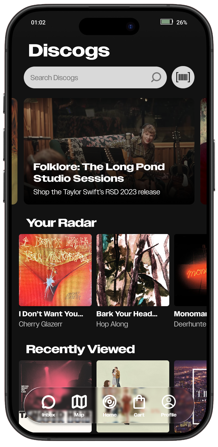
Homepage
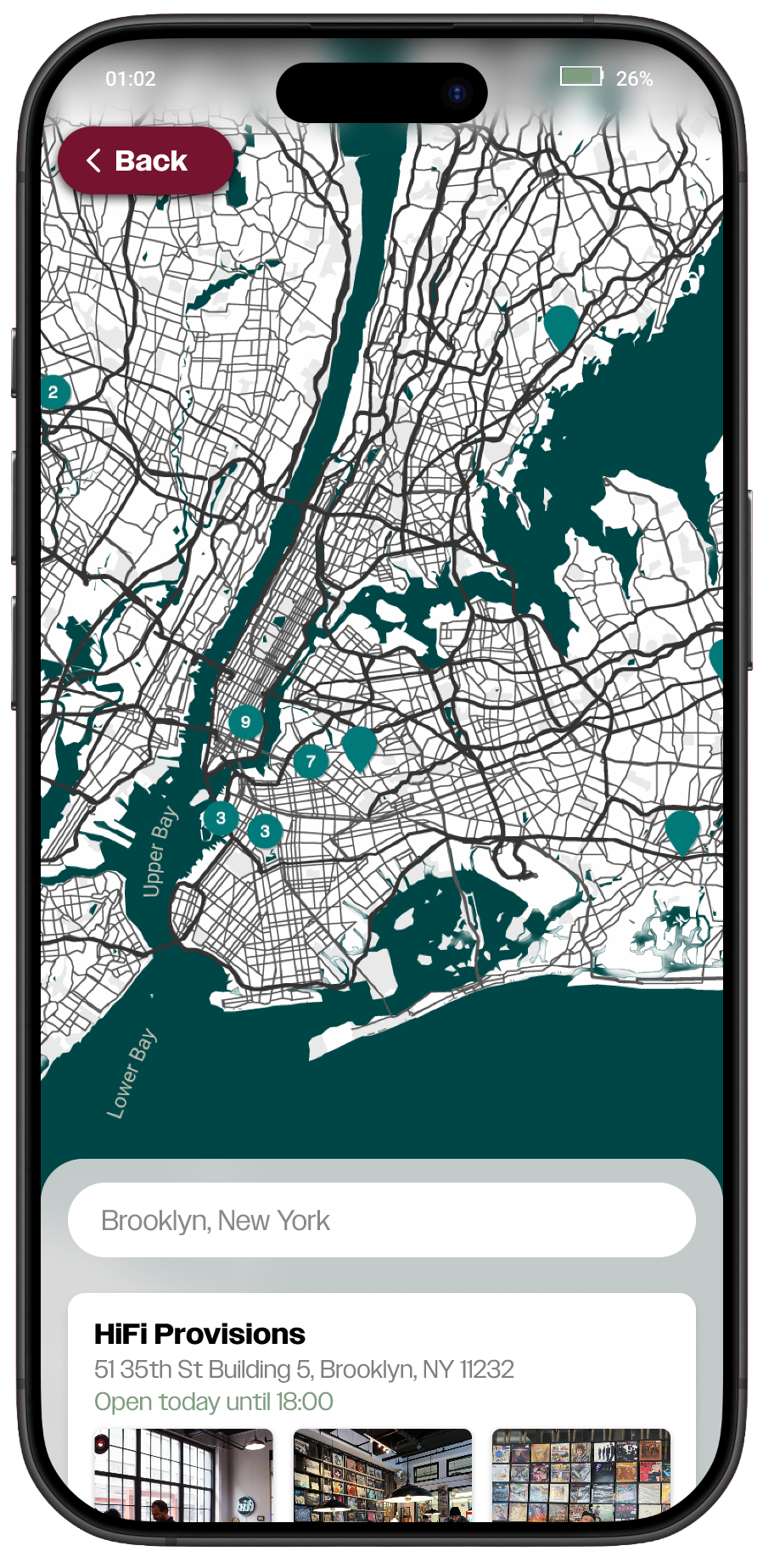
Map
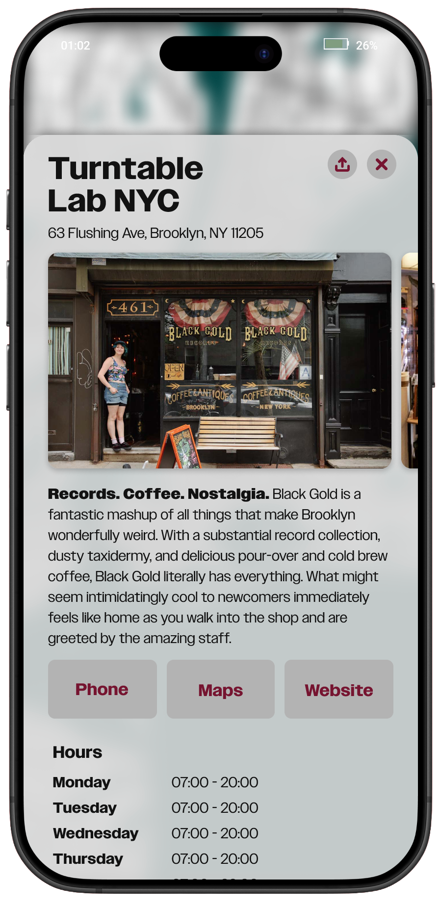
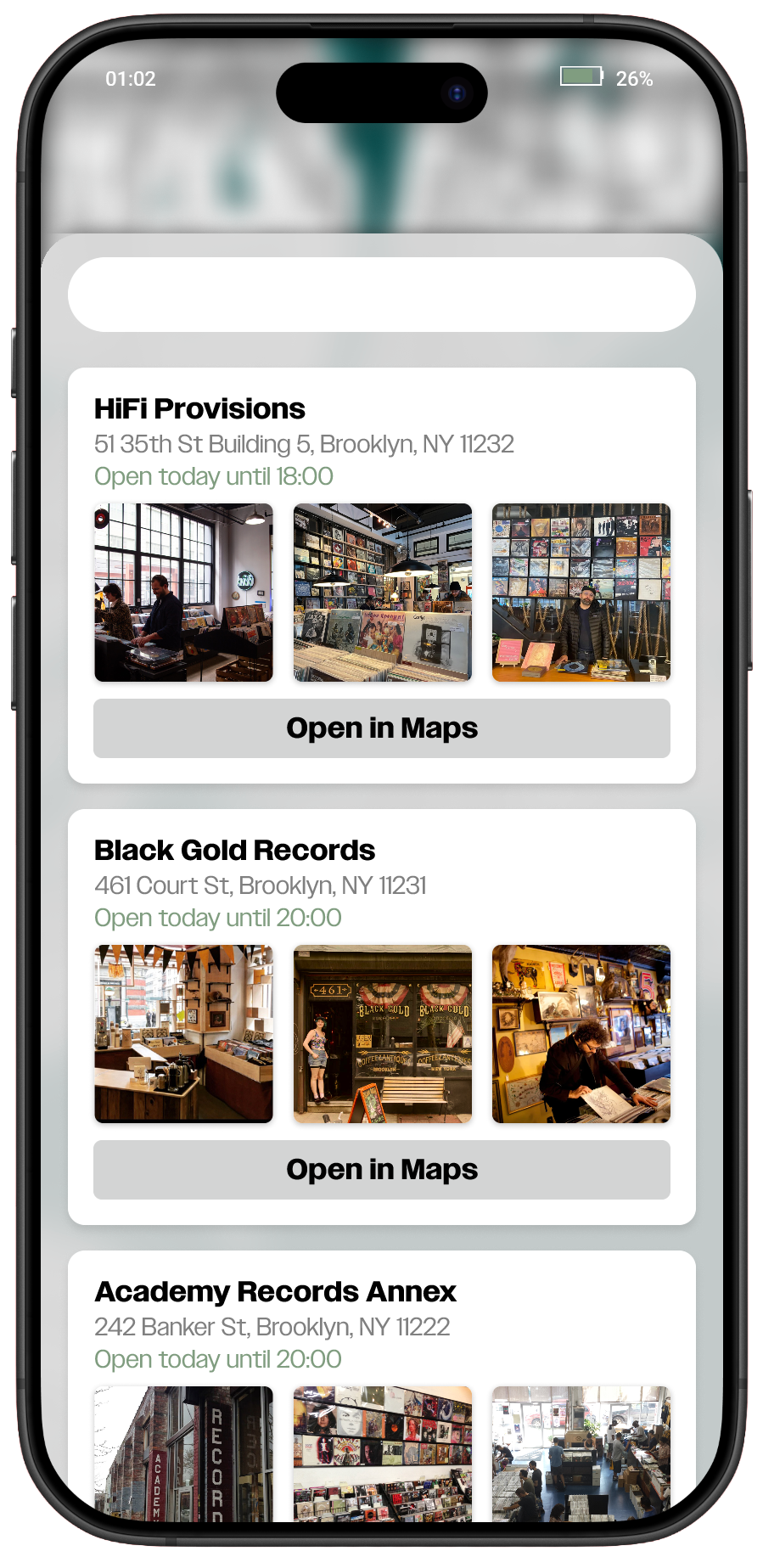
The biggest improvement I made to the app was The Record Store Locator. By improving this feature, I imagine it would encourage more people to support independent record shops. It would also be helpful in locating record stores specifically because sometimes, Google maps results might overlap with stores that sell records, but not record stores.
Profile
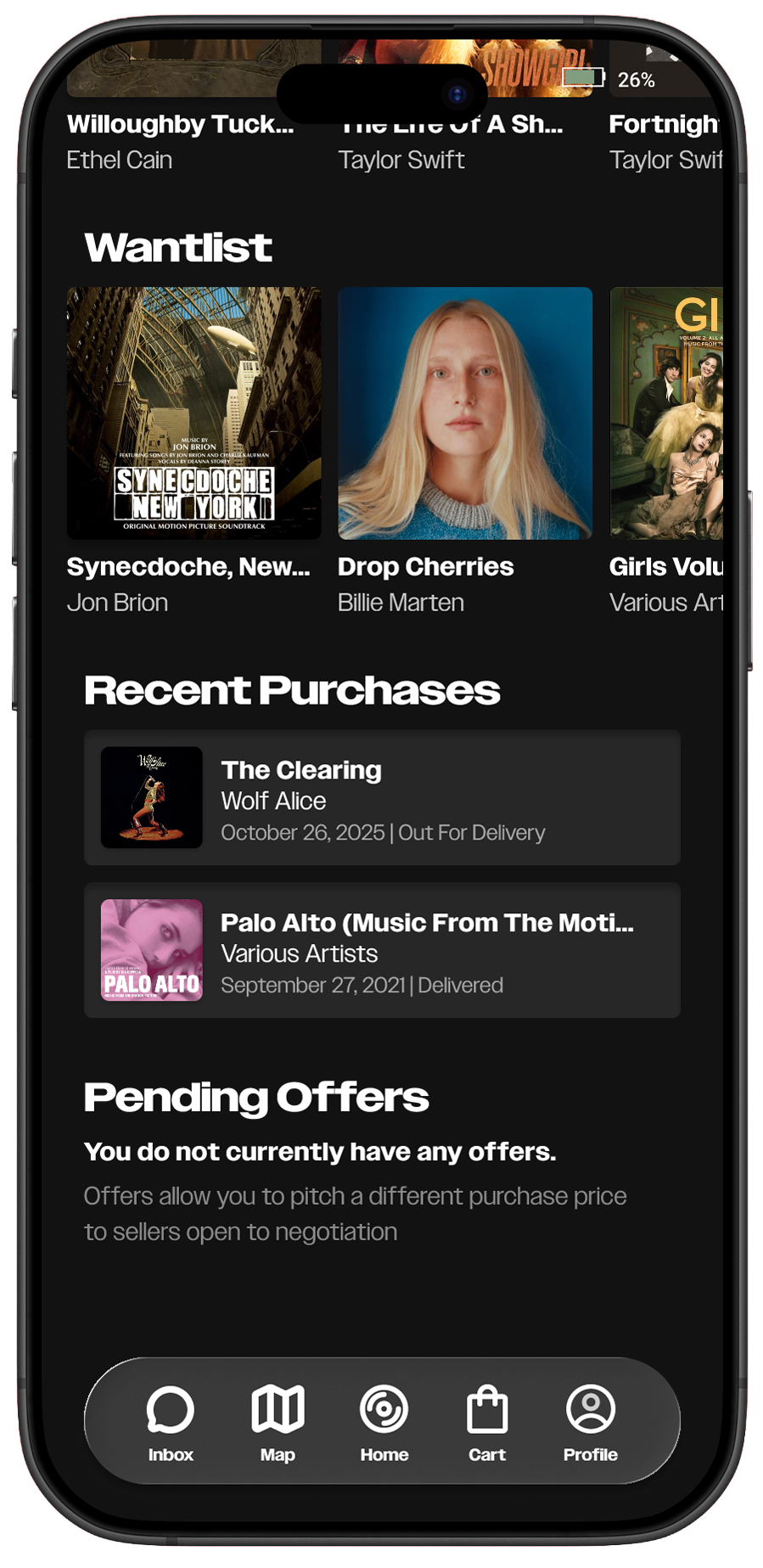
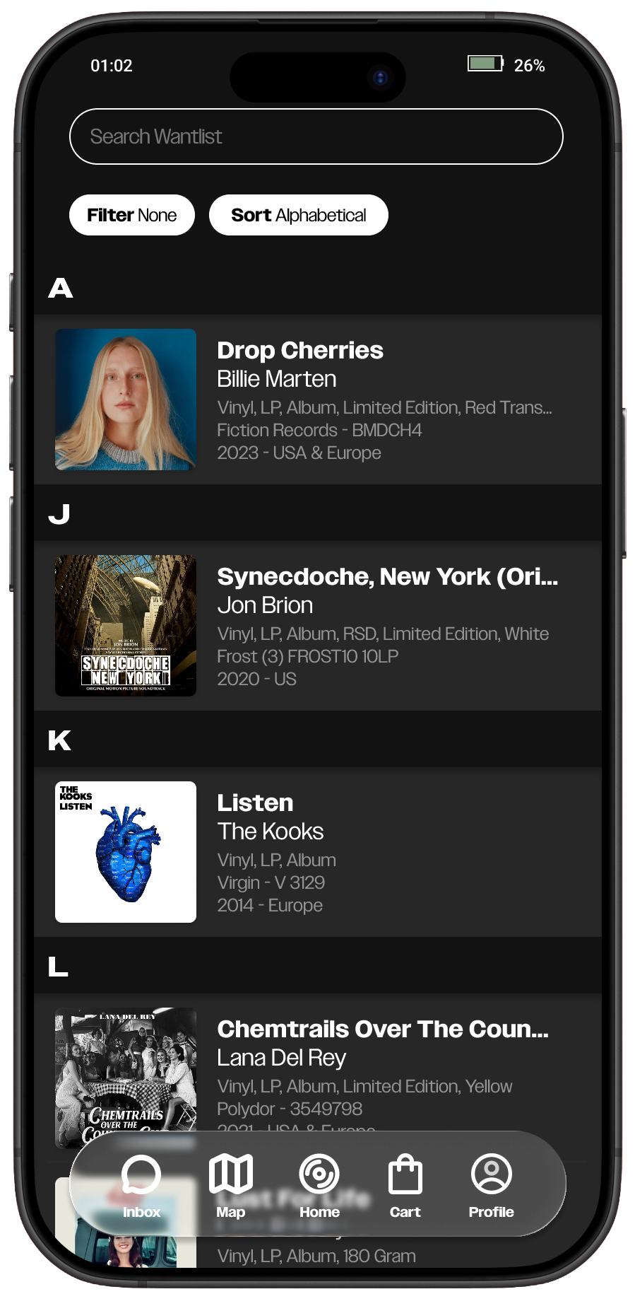
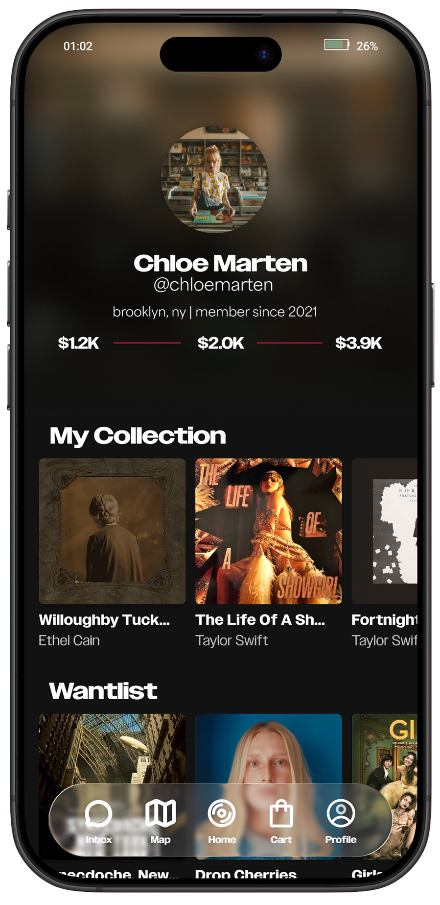
I wanted the profile to act as sort of a hub for users to look at their own collection and activity at a glance. Here, users can find their collection value, their collection, wantlist, recent orders, and pending offers.
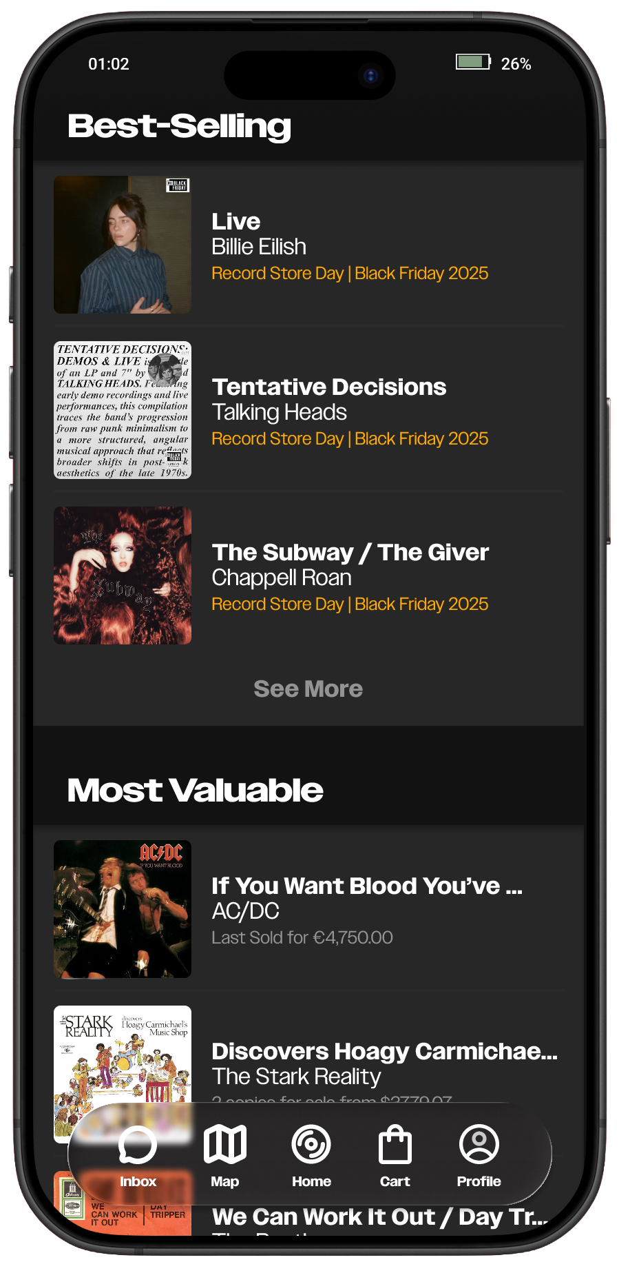
Not much was changed from the homepage actually! Here users can find trending and suggested titles, recently viewed, best-sellers, most-valuable, and curated lists.
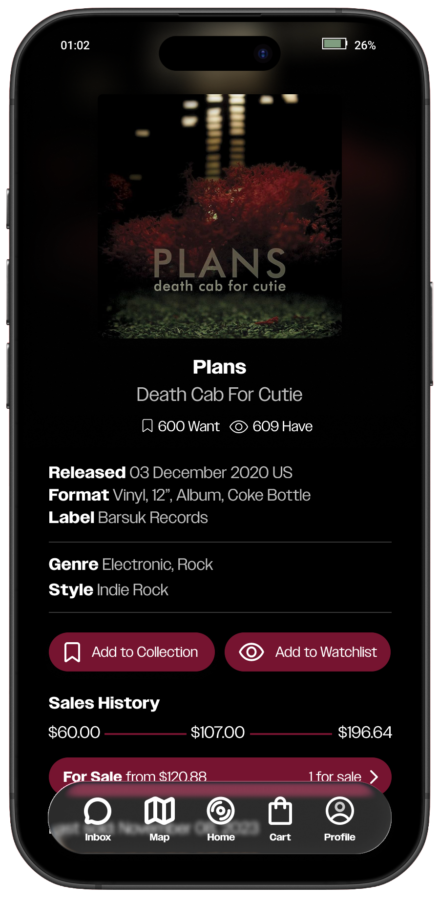
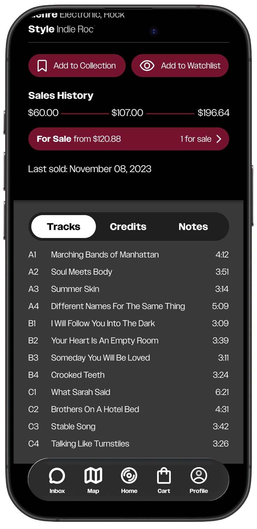
Product Pages
Since there’s a lot of information for products, I tried to clean up these pages by prioritizing the information that people are generally seeking out immediately, such as pressing, year, region, value, etc.